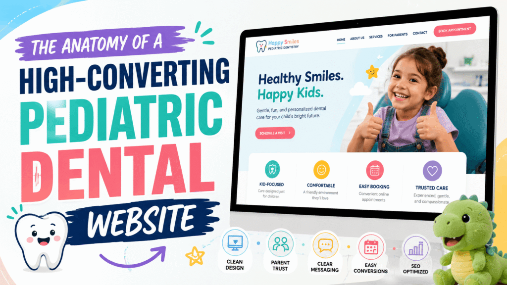
The First Impression: Why Pediatric Dental Websites Are Different
When a parent searches for a new dentist for their child, they are not just looking for a service provider; they are looking for a safe haven. Dental anxiety is incredibly common among children, and by extension, their parents. If your website feels cold, outdated, or difficult to navigate, parents will subconsciously associate those traits with your physical practice.
Building a pediatric dental website is not about slapping a few cartoon toothbrushes onto a generic healthcare template. It requires a deep understanding of human psychology, visual trust signals, and frictionless user experiences (UX) designed specifically for busy, often stressed parents.
In this comprehensive guide, we will break down the exact strategies—from color psychology to mobile-first booking flows—that transform a standard digital brochure into a highly converting patient generation engine.
1. The Psychology of Color Choices in Pediatric Web Design
Color is the very first thing a user processes when your website loads, happening in milliseconds before they read a single word. In pediatric dentistry, your color palette must balance two competing needs: the professionalism and hygiene expected of a medical facility, and the warmth and approachability required for children.
Avoid harsh, high-contrast colors like stark red or neon yellow, which can trigger subconscious alerts or anxiety. Instead, rely on soothing, nature-inspired tones or soft pastels.
| Color Family | Psychological Effect | Best Use Case on Website |
|---|---|---|
| Soft Blues & Teals | Calm, trust, hygiene, security, and serenity. Lowers heart rates and reduces anxiety. | Primary brand colors, headers, backgrounds, and navigational elements. |
| Mint & Soft Greens | Growth, health, nature, and healing. Highly approachable and non-threatening. | Secondary accents, informational icons, and trust badges. |
| Warm Oranges & Yellows | Happiness, energy, and youthfulness. Draws the eye instantly. | Primary Call-to-Action (CTA) buttons like “Book an Appointment”. |
| Clean Whites & Light Grays | Sterility, cleanliness, modernism, and space. | Main background color to ensure text readability and a clutter-free UI. |
2. Trust Signals That Convert Anxious Parents
Parents are inherently protective. A slick design is useless if it does not immediately establish credibility. Trust signals are psychological shortcuts that prove to a parent that their child is in capable, gentle hands.
A. Ditch the Stock Photography
Nothing screams “generic” faster than perfect, glossy stock photos of models smiling in a dental chair. Parents want to see the actual environment their child will walk into. Invest in professional, warm photography showcasing:
- The waiting room (especially if you have toys, games, or a kid-friendly setup).
- The dentists and hygienists interacting happily with real pediatric patients.
- The exterior of your building (this helps with local familiarity).
B. Deep, Empathetic Doctor Biographies
A standard medical CV listing your degrees is not enough. While credentials matter, parents want to know who is behind the mask. A highly effective pediatric dentist biography includes:
- The “Why”: Why did you choose pediatric dentistry?
- The Approach: How do you handle a crying or uncooperative child?
- The Personal Touch: Are you a parent yourself? What are your hobbies? Normalizing the doctor reduces intimidation.
C. Prominent Affiliations and Badges
Place logos of recognized authorities above the fold or in a sticky footer. Badges from the American Academy of Pediatric Dentistry (AAPD), board certifications, and local community awards provide instant, unspoken validation.
“Over 70% of parents state that reading online reviews and seeing real photos of the clinic are the two most critical factors when selecting a new pediatric healthcare provider.”
3. The Mobile-First Booking Flow: Designing for the Busy Parent
Consider the environment in which a parent is looking for a pediatric dentist. They are rarely sitting peacefully at a desktop computer. They are likely on their smartphone, holding a toddler, waiting in a school pickup line, or multitasking. If your website requires them to pinch, zoom, or hunt for a phone number, they will bounce to your competitor.
The Rule of Thumb for Mobile UX
All critical actions must be achievable with one hand, specifically the thumb. This requires an interface that feels more like a modern application than a traditional webpage.
- Sticky Call-to-Action (CTA): The “Book Appointment” button and a “Click to Call” icon must remain visible at the bottom or top of the screen at all times as the user scrolls.
- Frictionless Intake Forms: Never ask for 20 fields of information on a first interaction. Your initial booking form should only ask for Name, Phone, Email, and “What does your child need?” The heavy HIPAA-compliant paperwork can be texted or emailed automatically after the lead is captured.
- Speed is Non-Negotiable: A mobile-first design means utilizing lean code. Bloated websites that take more than 3 seconds to load on a 4G connection will lose massive amounts of traffic. Processing styles locally rather than relying on heavy external networks ensures instant loading.
4. Structuring Content for SEO and AI Search
Having a beautiful site is only half the battle; it needs to be found. Modern SEO for pediatric practices goes beyond just placing “pediatric dentist near me” in the footer.
FAQ Schema for Generative AI
Search engines are increasingly using AI overviews to answer parent questions directly on the search results page. To capture this traffic, structure your service pages with clear Question and Answer formats. Using JSON-LD FAQ Schema helps search engines instantly understand and extract your expertise for queries like, “At what age should a child first visit the dentist?”
Dedicated Treatment Pages
Do not lump all your services onto one page. Create distinct, highly optimized pages for specific treatments:
- Infant Oral Care
- Special Needs Dentistry
- Sedation Dentistry for Children
- Dental Sealants and Fluoride
This localized, specific content strategy builds topical authority, making Google view your site as the ultimate local resource for children’s dental health.
5. HIPAA-Conscious Infrastructure
In healthcare, security is synonymous with trust. If a parent submits their child’s sensitive health history through your website, that data must be protected. Ensure your website utilizes:
- End-to-end SSL encryption.
- HIPAA-compliant form processors (never send patient data via standard, unencrypted email).
- Secure, managed hosting environments with regular vulnerability patching.
Elevate Your Practice with a Purpose-Built Website
Your website is the digital front door to your practice. It sets the tone for the entire patient experience before a parent ever speaks to your receptionist. A generic, slow, or confusing website silently turns away dozens of highly lucrative patients every month.
To win in today’s competitive digital landscape, you need a platform engineered specifically for trust, speed, and conversion. At Perosite, we specialize in high-converting pediatric dental website design. We build HIPAA-conscious, lightning-fast interfaces that reassure parents and seamlessly drive new appointment bookings.
Ready to upgrade your practice’s online presence? Contact us today for a free website audit and a custom quote to start filling more chairs with happy, loyal families.